
Category: Measurement
-

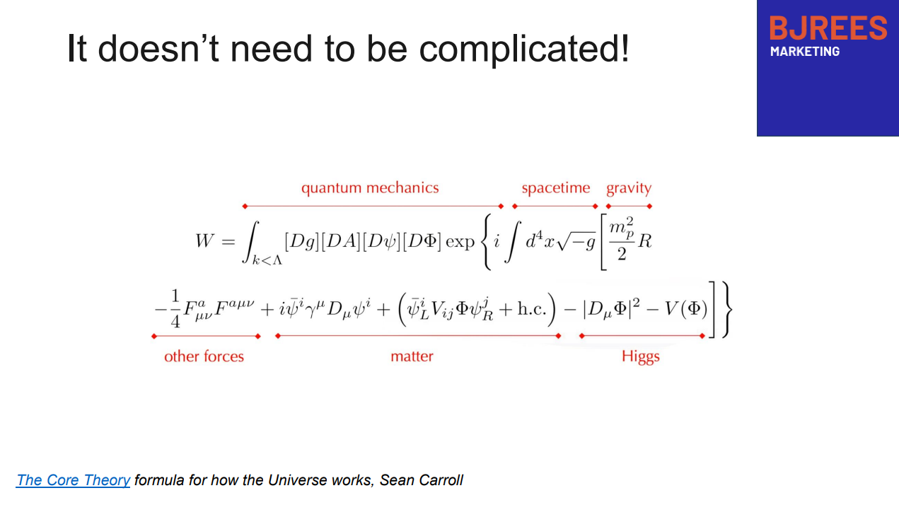
B2B Marketing Measurement*
* Now with added AI Measuring the performance of marketing departments has always been a primary objective for marketing leaders. There have been many models and proposals for how to do this, most of which I’ve used over the years. But now there is an added dimension – how well is your AEO and GEO…
-

Brand is how you impact GEO
Why AI Visibility Lets Us Measure Brand Impact. Finally. For as long as I’ve worked in marketing, there’s been one problem I could never quite solve: how to measure the impact of brand work. We’ve always had solid tools for performance — clicks, conversions, funnel stages. But brand strength? Hand-wavey and unmeasurable. I’ve tried surveys,…
-

Making decisions in a Bayesian world
Most of your time as a marketing leader is spent trying to make decisions with inadequate data. In an ideal world, we would have run an A/B test on everything we wanted to do, looked at the numbers and then made a decision. Which image should we use for our new advert? What message? What…
-

Have a plan. But double down on what’s working
There are always too many things to do running a marketing department. The essence of your job as a marketing leader is making strategic choices about where to double down and where to pause. This is what makes the job both interesting and difficult. Below I’ve provided a scorecard that I’ve used many times in…
-

Balance and Flow
Measuring marketing performance is tough. At times I’ve argued that it’s impossible and therefore pointless. But I don’t think that’s true. As a starting point pretty much any company you work for in a senior marketing role, will expect you to understand the impact of your work (and that of your colleagues). Part of this…
-
Calculating return on marketing investment (ROMI)
Here’s a short presentation on how to calculate return on marketing investment. It’s heavily oversimplified but the principle is simple – do a back of the envelope calculation before you start spending money, particularly if looking at a new system that only promises an uplift (rather than a significant change in performance).
-
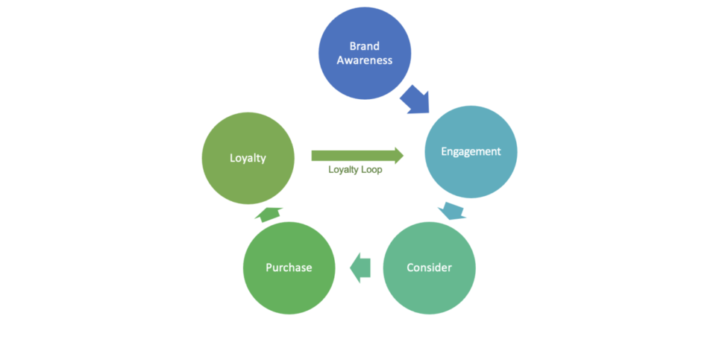
The marketing flywheel – an alternative to the marketing funnel
A lot has already been written about how the old marketing funnel model is no longer as relevant in modern B2B organisations as it used to be, and how a flywheel model is more appropriate for how customers really buy (as an old colleague said to me “The person who invented the marketing funnel should…
-

Why ROI calculators aren’t enough
ROI calculators are a pretty common tool amongst B2B marketers. On the face of it, the logic is simple – show a calculation of how the time saved from subscribing to your product equates to money and how that money is less than the annual subscription cost charged. Then surely the sale should be in…
-

How We Grew Marketing Sourced Pipeline by 20% in One Quarter
We’re about to go into our quarterly review period at Redgate. We don’t just run QBRs, we also run reviews across all parts of the business. These are a chance to examine the last three months – what worked? What’s going well? What’s not going well and needs fixing? All part of a strong agile…
-

How Collaboration Can Grow Revenue
Why do Marketing and Sales departments need to collaborate? Sure, it’s nice, but beyond people getting on better together, how can it really impact the numbers, the outcomes for the business? We’ve just spent a month at Redgate improving the collaboration between the two departments and we can see the direct and measurable impact on…
-

Five Myths About The Marketing Revenue Engine
I love the book Rise of the Revenue Marketer. In it Debbie Qaqish describes the need for a change program to move your marketing department from being a cost centre (“We’re not sure what marketing do, but we need them to do the brochures”), to a revenue centre (“They’re responsible for generating a significant proportion of our company’s…
-
Building a MarTech Stack at a Small Organisation
I recently spoke at the B2B Ignite conference in London on “Building a MarTech Stack at a Small Organisation: A Real World Example of What’s Worked and What Hasn’t”. Here are my slides from that talk. Rules of Thumb It’s a lot of pictures, so might be hard to understand without the actual talk! Any…
-

Measuring Outbound vs. “Always-on” Marketing Performance
Whenever I meet customers I always slip in a marketing question or two along the lines of “Where did you hear about us? What brought you in to Redgate?”. One of the answers from a couple of months back was: Well a year ago, I got a new boss and she told me that I had…
-

Sentiment Analysis of Twitter – Part 2 (or, Why Does Everyone Hate Airlines!?)
It took quite a while to write part 2 of this post, for reasons I’ll mention below. But like all good investigations, I’ve ended up somewhere different from where I thought I’d be – after spending weeks looking at the Twitter feeds for different companies in different industries, it seems that the way Twitter is…
-

Sentiment Analysis of Twitter for You and Your Competitors – Part 1
This post is split in two, primarily because I hit a roadblock half-way through the work – and I wanted to get the first part out. Second part to follow once I’ve fixed the difficult problems! A lot of people follow the Twitter feeds for competitors or, of course, themselves. But, one of the things…
-

Measuring Customer Experience
Customer Experience (CX) – it’s a popular topic right now, analogous to the importance of User Experience (UX) in the world of product development. And something which I strongly believe is important for a marketing team to get right. So, we all know that getting your Customer Experience great and consistent is important for all of…
-

How Short Term Data Driven Decisions can be Dangerous in the Long Term
Jeff Bezos’s letters to shareholders are, of course, famous for their insight, not only in to how Amazon functions, but also for their advice on how to run a certain type of business. One of my favourite excerpts, from the 2005 letter is: As our shareholders know, we have made a decision to continuously and significantly…
-

Why Measuring Marketing ROI is Like Trying to Measure Employee ROI – Impossible!
I’m beginning to think I might need to change the tag line for this blog. One of my earliest posts was about how we needed to apply some scientific rigour to the process of marketing attribution and therefore ROI. How can marketers be getting away with such unproven and unprovable techniques, spending all this money…
-

The End of the Marketing Plan
I’ve read a couple of books in the last year both with something to say on the subject of marketing plans. Well, I’ve read one and given up on the other. The one I finished was: Lean Enterprise by Jez Humble, Barry O’Reilly and Joanne Molesky And the one I barely got started on was:…
-

Market Sizing – Old vs. New Markets
I was attempting some market sizing activity this week. It’s something I haven’t done for a few months and quite frankly I’d forgotten how hard it was. I start from a premise that the future is completely unpredictable. Really, aren’t we kidding ourselves when we think we can predict how many people will buy our…
-

Measuring Offline to Online Marketing Attribution
This post is about one of the many issues facing anyone trying to do marketing attribution – how do you measure the impact of offline activity on online success? If you’re selling online, but you’re carrying out offline activity (TV ads, magazines, direct mail, events, arguably word-of-mouth) then you don’t get this sort of insight…
-
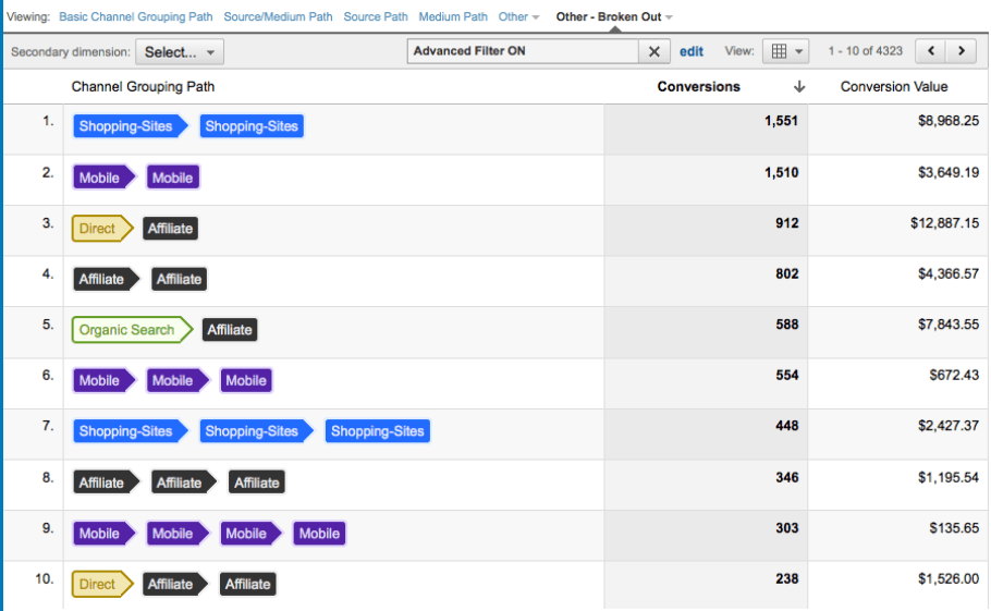
When Marketing Isn’t Really Marketing – Google Analytics Multi-Channel Funnels
I was excited this week about the prospect of finally having the time to play with Google Analytics’ advanced Multi-channel Funnel (MCF) functionality. As announced at their summit last year, they’ve extended their advanced attribution modelling to all GA users and this provides the opportunity to (finally!) try and attribute some measure of value to…
-

How To Measure Campaign Success
Quite a simple post this time round. Essentially how I measure the success of a given campaign or piece of marketing work. NB: This isn’t the Holy Grail of properly attributed marketing ROI – when I’ve worked that, I’ll post it up, if I haven’t retired first – but instead a framework for how to…
-

Value and Predictable Revenue Improvements
I really like this very simple post about how to buy wine, when you don’t really know much about it (which is definitely me). Basically, select a price (say, £7.95), then select a wine at that price. That’s kind of it. And what Evan Davis is saying is “Statistically, give or take anomalies, most wines…
-
Five Tips for Implementing Marketing Analytics
The book Competing on Analytics by Thomas Davenport and Jeanne Harris is a short but very interesting read about the need for organisations to significantly improve their analytical capabilities if they want to compete in the modern marketplace. The argument, quoting directly from the author is that: In today’s global and highly interconnected business environment,…
-

Marketing and Data Testing
Anyone who’s worked in a digital marketing environment will probably recognise one of the following two scenarios – 1) You’re merrily working through your day when you check up on a KPI graph that normally bobs along nicely only to see some unpleasant looking change (generally a “drop” of some sort). Panic. 2) You’re merrily…