It’s easy to forget, amongst the talk of marketing automation, social media strategy, customer experience, lead nurturing and so on, that you still need well written, well targeted and well designed ads to reach new customers.
I spotted a great example this week, and just wanted to run through what I thought was great about it.
Channel, Placement and the Ad
Here’s the initial ad that I spotted:
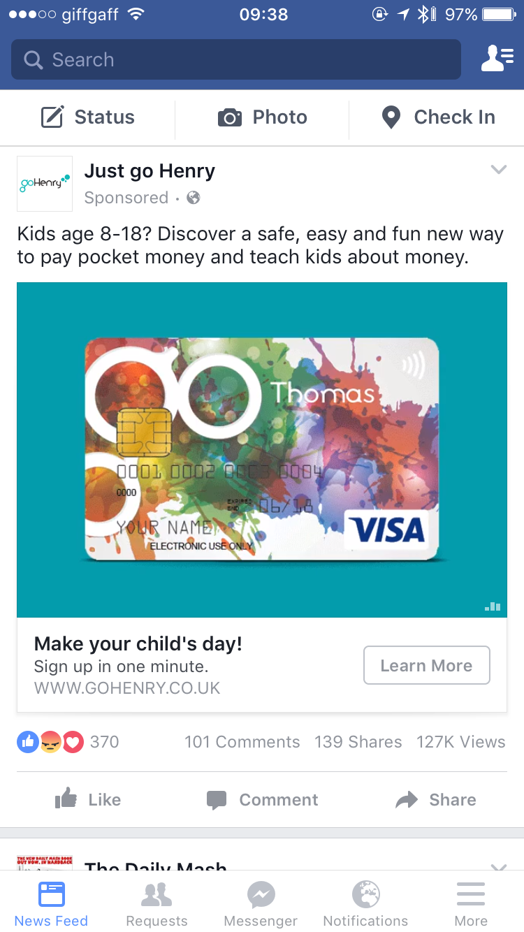
What’s so great about this?
- Platform – I see it on my mobile phone. Outside work I spend far more time on my phone than on a laptop, it’s a B2C offering, so mobile is best.
- Channel – you can’t quite see from this, but the ad is on Facebook. Personally I view Twitter and LinkedIn as “work-related” networks and Facebook as a “non-work” platform. There’s some overlap, but little. So an ad which is targeted at me as a parent makes a lot more sense on Facebook.
- Targeting – well, I’m guessing here, this could be great targeting, or they could have advertised to everyone in the world (at great expense!). But, the ad is for a product for people with children of a certain age (8-18). I’m a 44 year old male, I doubt they know I have kids, but it wouldn’t take much research to figure out the probability that I do, and that they would be of a relevant age (I’m less likely to have an 8+ child if I was 25 or 65). Of course, if Facebook is really clever, it knows that I do have kids (from my posts), and have sold that information to GoHenry. Like most advanced analytics/AI – creepy, but impressive.
- The hook – “Kids age 8-18? Discover a safe, easy and fun new way to pay pocket money and teach kids about money”. What a great line! First they’ve identified me with the kids and ages. Second, they know the pain of paying pocket money in a world where most money is digital (finding change each week is a pain!). And they know most parents are paranoid about their kids attitude to money (that in reality it doesn’t grow on trees).
- The graphic – you can’t see it above, but the ad cycles through a list of names on the credit card, showing how you can personalise the card for your kids – something I know they’d love. NB: What would have been genius, was if they’d known my childrens’ names (from Facebook) and inserted those in to the ad – how impressive would that have been? True personalisation.
- Call to Action – “Sign up in one minute”. Simple, clear, pain-free.
The Landing Page
Okay, so you’re convinced by the ad, so you click on the picture.
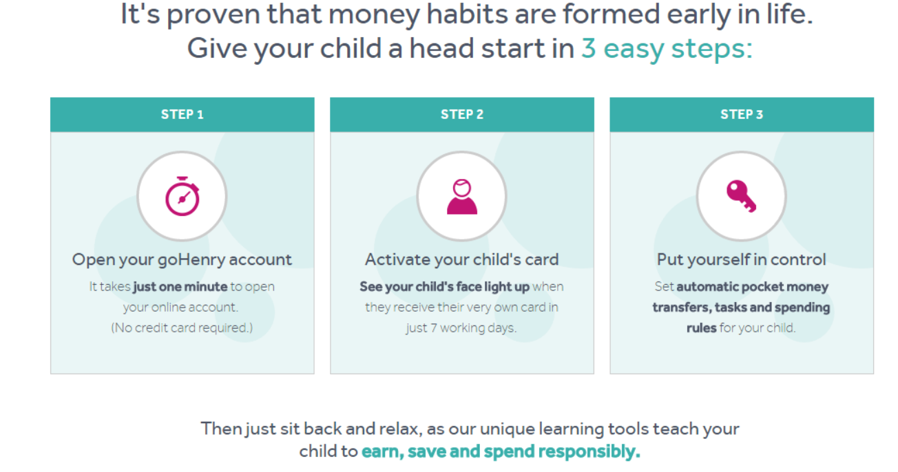
The landing page – it’s a big page, so click on the link to view, but it has the following elements in order, that are done well:
- Call to Action – right at the top. And it’s made so simple for you – Sign Up Now, to create a new Custom Card for your child.
- Validation – right under the CTA (and indeed all over the ad and landing page) is the Visa sign. This immediately lets you know that this is a safe financial institution, that you’re not putting your money in the hands of some start-up. “Designed for children in collaboration with Visa” – so you know they worked with Visa to get it right and are big enough to work with a premium partner.
- Short video – the video says “Under 1 minute” so you know you’re not going to have to spend ages learning about the system. No-one has time for anything over a minute nowadays!
- Free trial – straight under this: “Try if free for 2 months”. Great, so if you’re not sure about this whole thing you can try it for 2 months, see if it’s right then stop if it’s not for you. Again, they’re removing a barrier to trial. One thing worth noting – you can see that their measure is to “Get trials”, to get people to sign up in some way.
- Validation from a real user – under this is a quote from a real person. I personally don’t trust these a great deal (anyone can get a quote for any product – it might be that 1 person loves it, and 1,000 hate it!). But still – it helps you think that there are already people happily using it – important when you’re talking about a financial product that needs trust.
- Benefits, and emotional appeal – after a few more logos, there’s then a nice section which describes how the thing actually works and describes the benefits in nice clear language. Reading this, I know, in a matter of seconds, how it will work and what immediate benefits I’ll get. And there’s a nice emotional pull on “Buy this if you want your kids to grow up as financially responsible people”!:
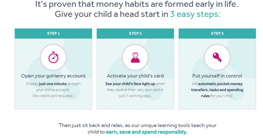
- Further details – there’s then another section, more detailed explaining the features and benefits of the product. What I like here, over the whole page is that there’s a gradual increase in information as you become more interested. At the top you just want to know “What is this thing?”. But if you’ve read further down, chances are you’re more interested (else why would you be there?), and you want more detailed info about what it actually is. This worked really well for me.
There’s then a ton more sections – about security, how it works in practice, about the mobile apps, about good financial habits and so on. All good stuff, though I couldn’t help feeling exhausted about half way through.
Still, I thought this a great example of the art of a good advert – an art that isn’t dead yet! A well targeted app, from a company that understands their customer, simple CTAs, good validation, clear explanation of benefits, emotional appeal and so on.
You never know, I might even sign up!